Film4 identity
When the UK's most loved and iconic film channel launched on Freeview, it needed to make a big impression. Taking the distinctive numeral '4' as a starting point, we redesigned the brand from the ground up, beginning with a bold and confident new logo design calling upon inspirations from the De Stijl and the Bauhaus art movements.
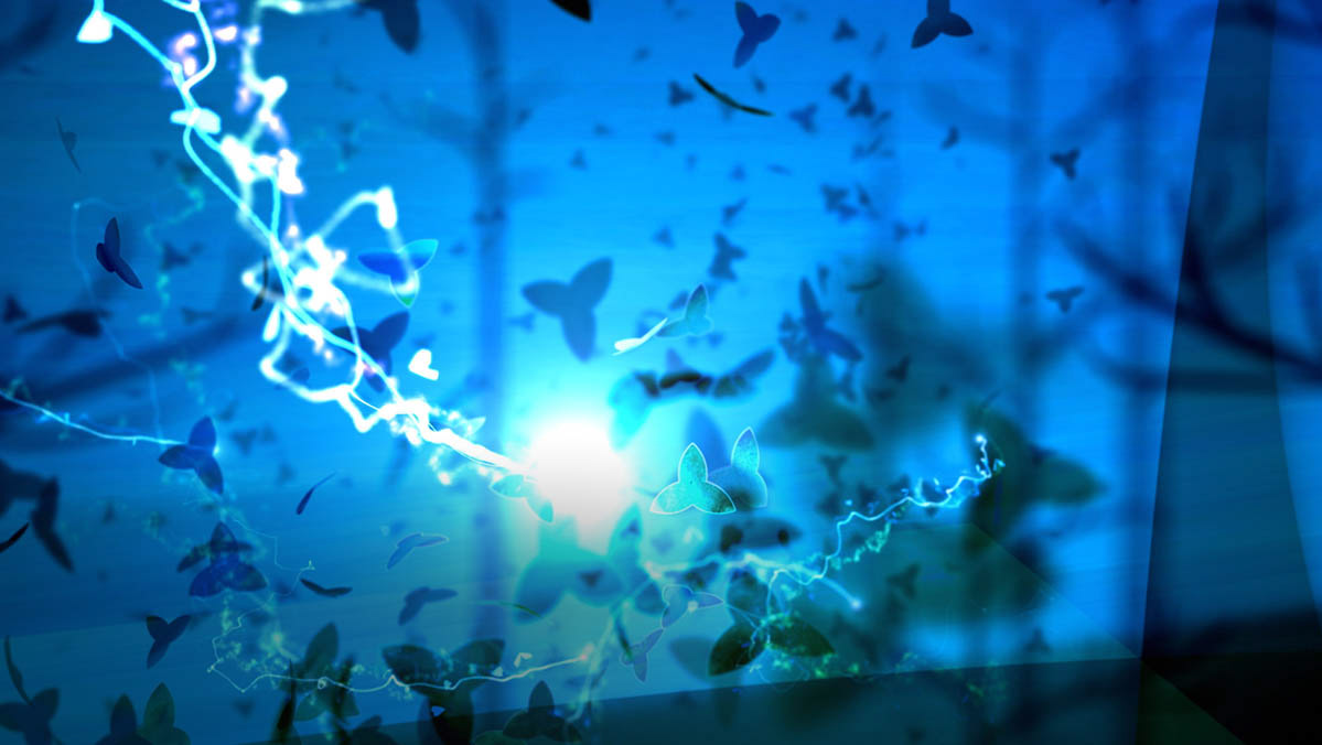
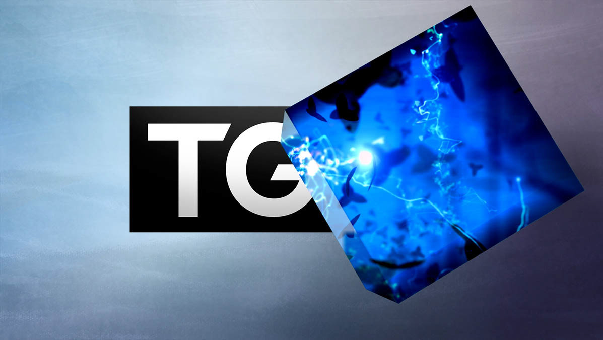
We then set about implementing this into the on-air elements, building and refining the animations from early scamps to the finished articles.
The London type foundry Fontsmith worked with us to create a characteristic typeface to compliment the new on and off-air styles, and for audio we got to work with one of our favourite electronic composers, Kelpe, in creating a tasty set of weird and wonderful tracks to accompany the animated stings and bumpers.
Film4 ident, channel menu, promo endboard, 'Self Portrait' caption, Film4 typeface and 'Your Films at 9' promo


