


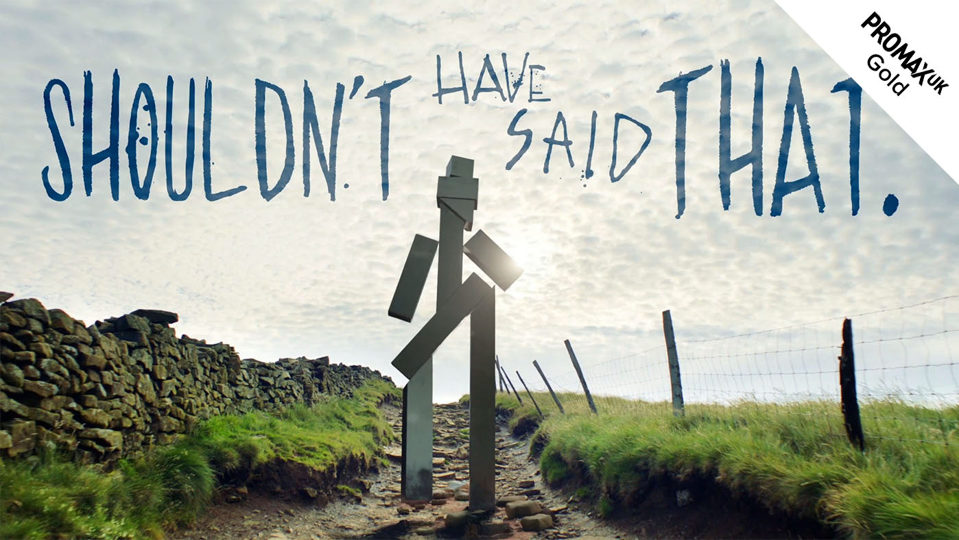
Channel 4 / 'The Jury - Murder Trial' TV sting

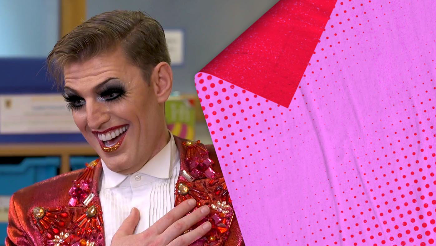
Channel 4 / Big Boys S2 'Glory Hole' video
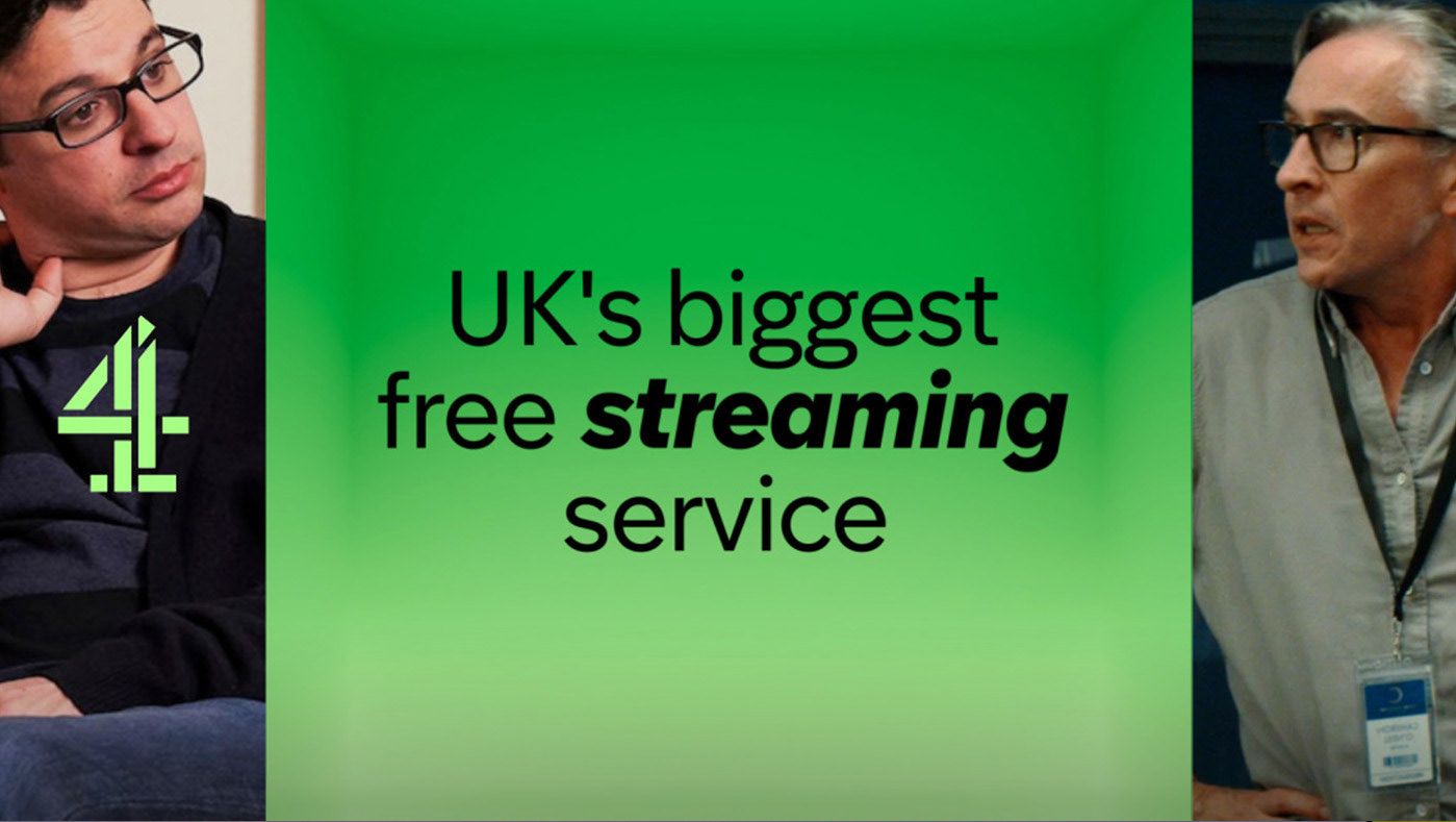
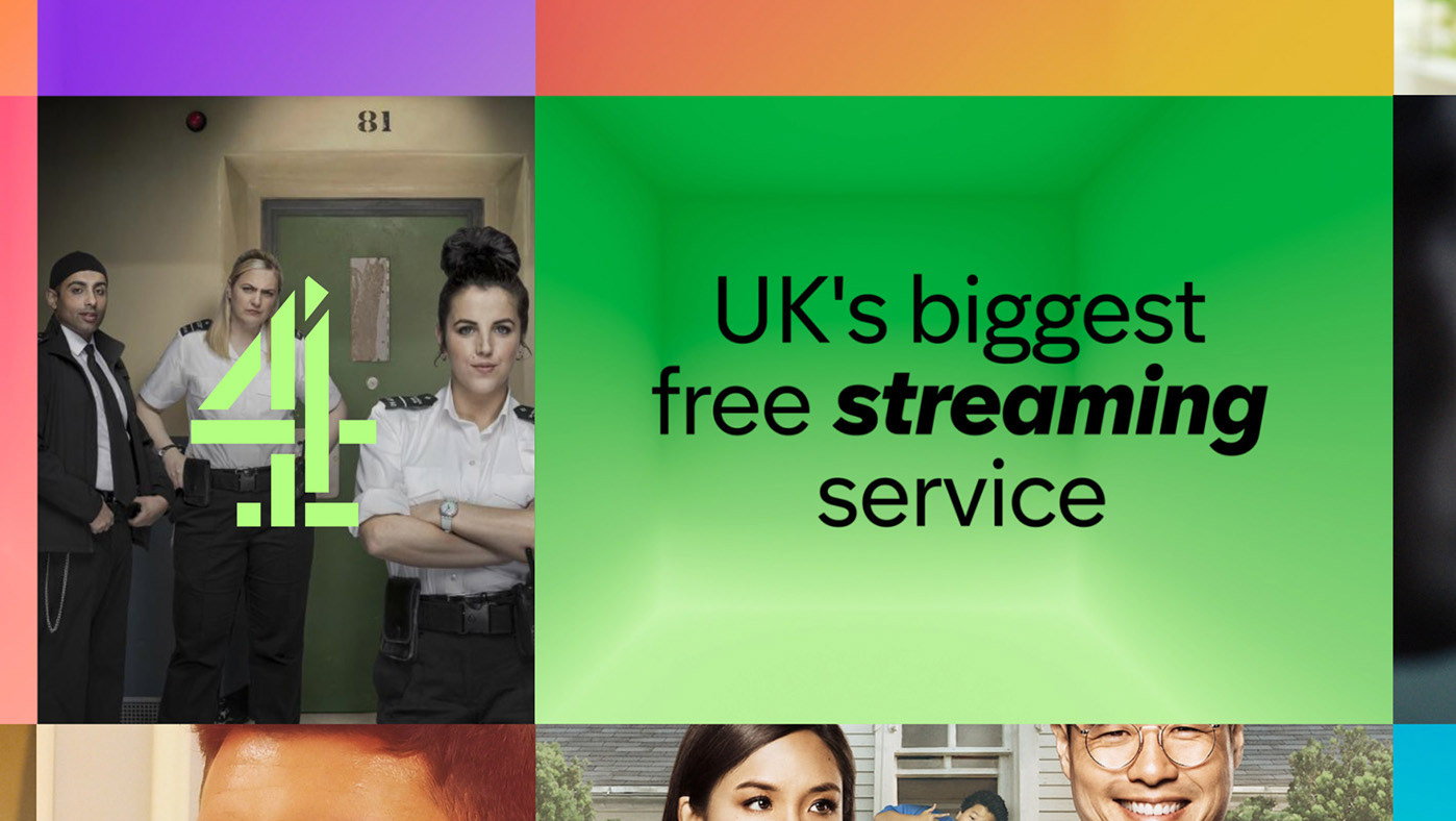
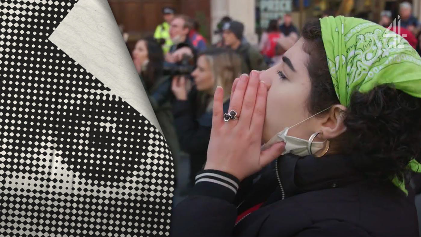
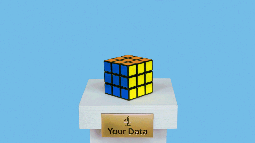
Channel 4 / 'Partygate' social teaser & case study gfx
THIS™ / social and branded content
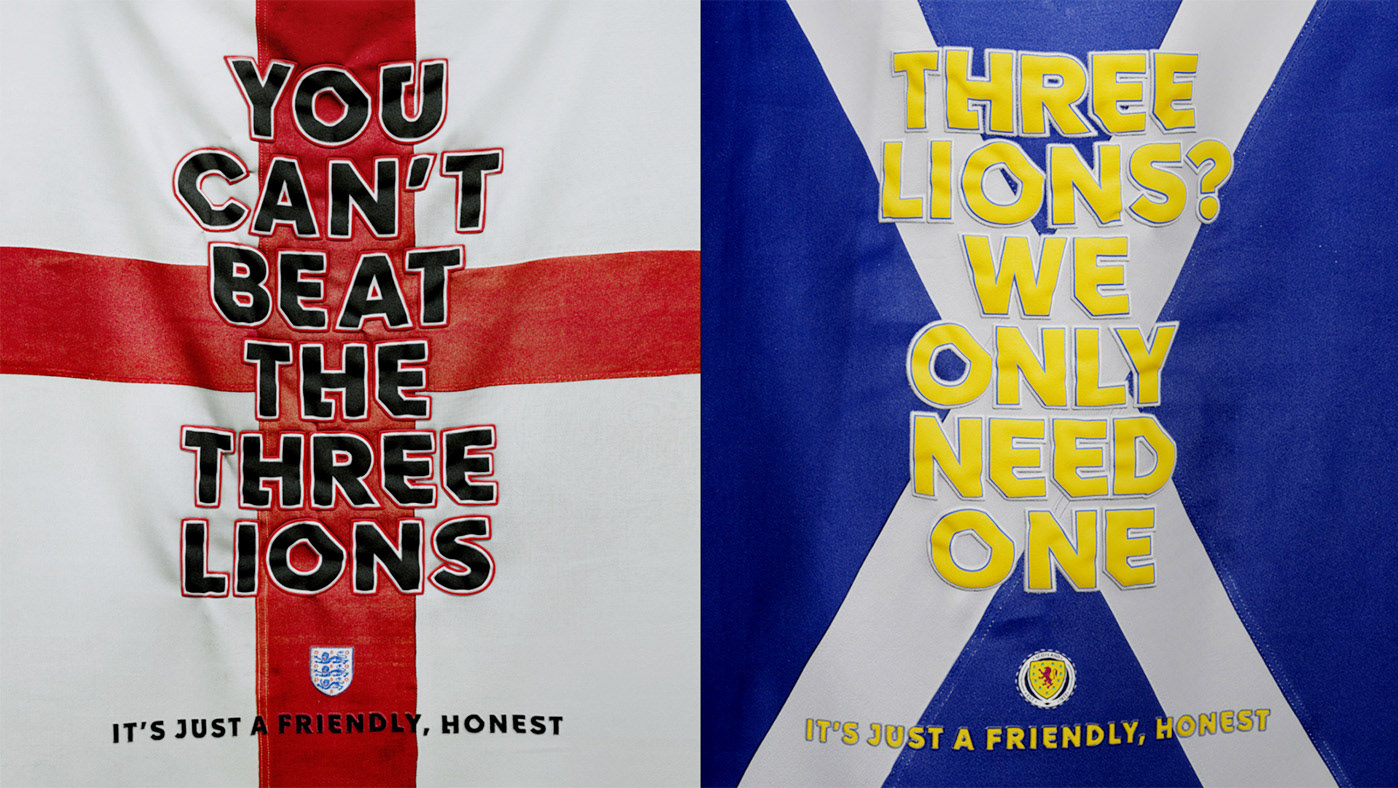
Channel 4 / Scotland v England social teasers
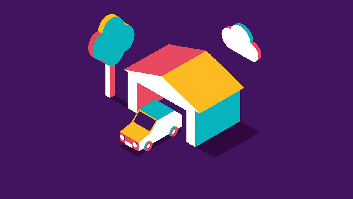
FibrePlanner / identity
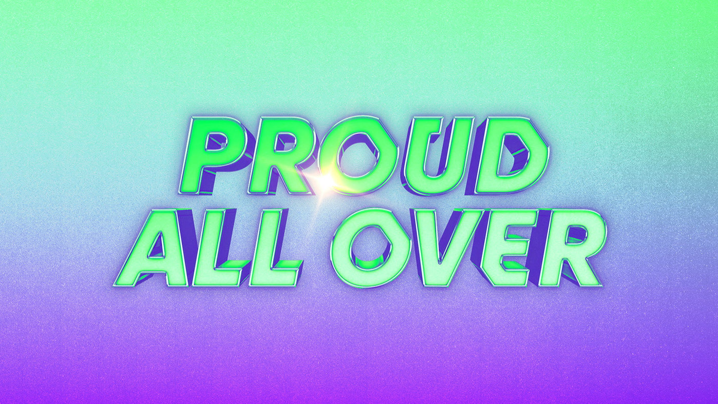
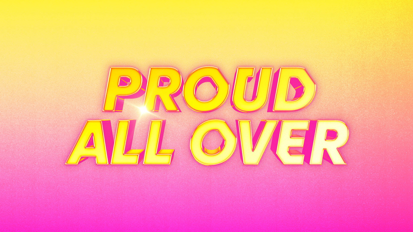
Channel 4 / Pride digital posters
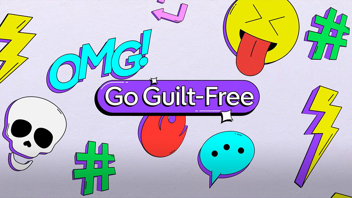

E4 / 'Go Guilt Free' social media toolkit

72 Films / website
Channel 4 / 'Vardy v Rooney' social film
Channel 4 / ‘Range’ promo motion graphics template
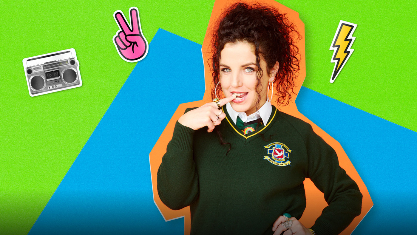
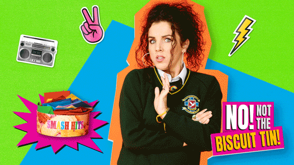
Channel 4 / 'Derry Girls, Biscuit Tin' social films
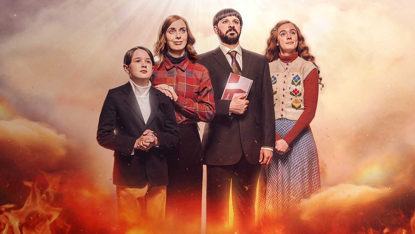
All 4 / 'Everyone Else Burns' social post
Caravan / identity & website
Channel 4 / 'Every Mind Matters' TV idents

Crackit / website
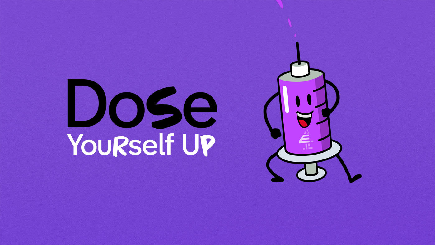
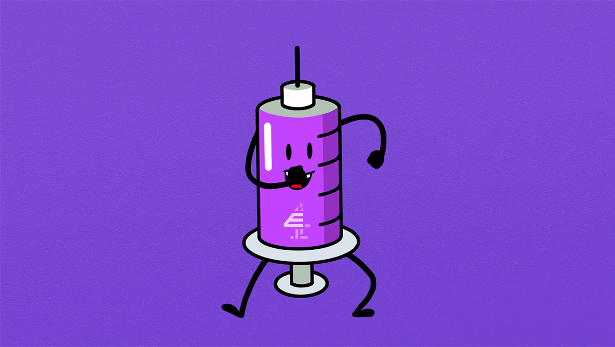
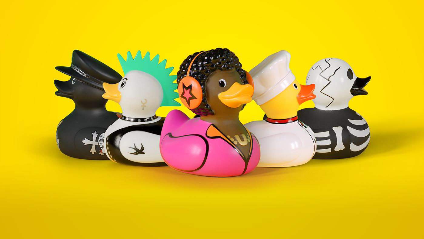
E4 / 'Dose Yourself Up' season identity

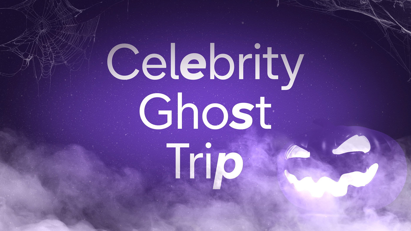
E4 / 'Celebrity Ghost Trip' on-air teaser
All 4 / 'ENG4GE' product showreel
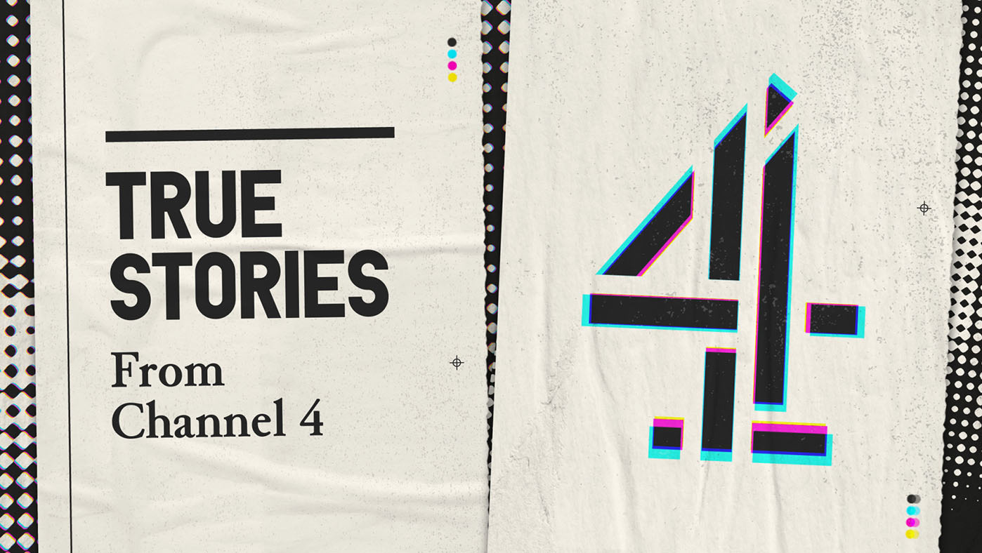
Channel 4 / 'True Stories' social packaging
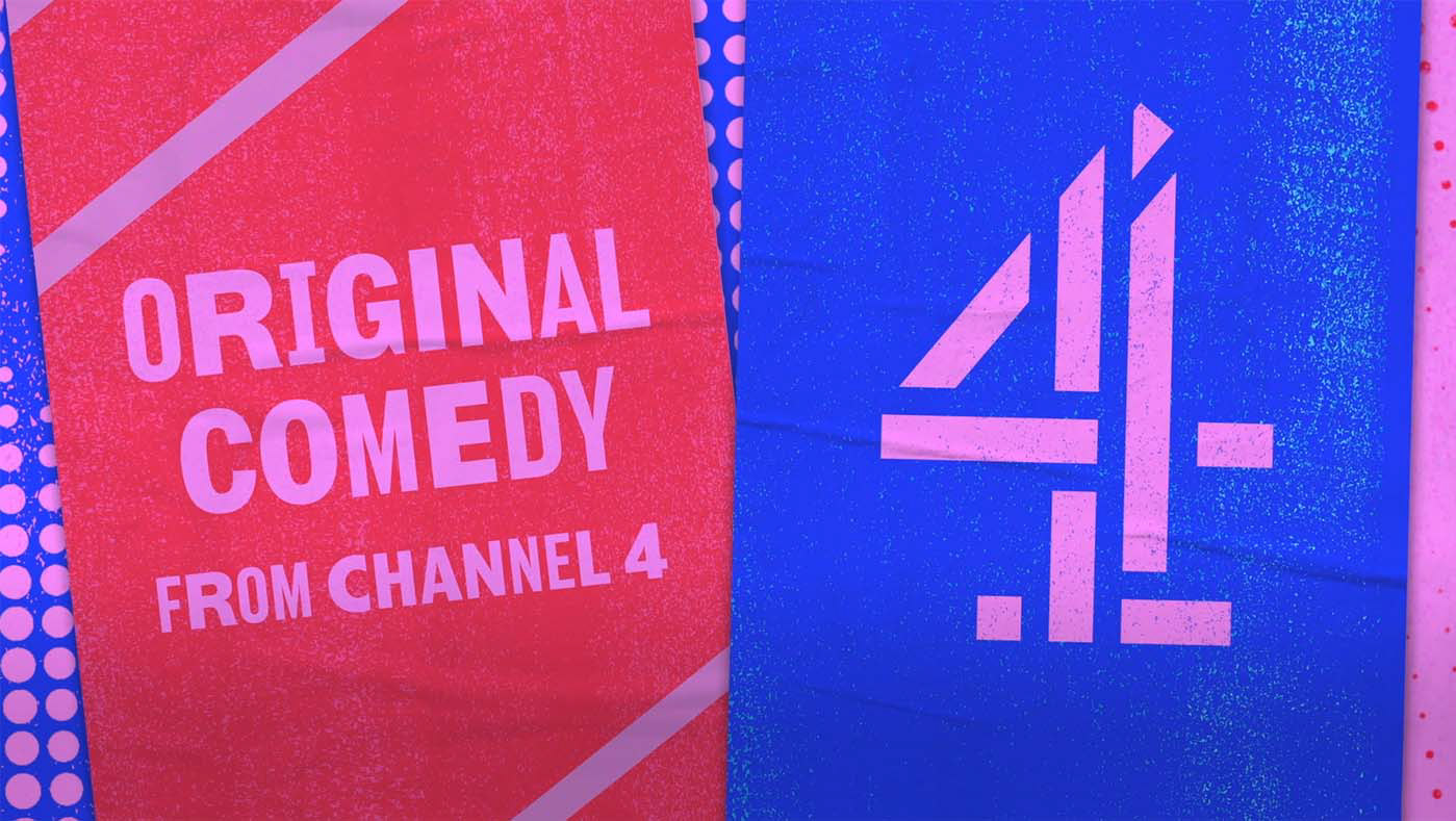
Channel 4 / 'Original Comedy' social packaging

Expectation / identity & website

Channel 4 / 'The Human Test' tv ad
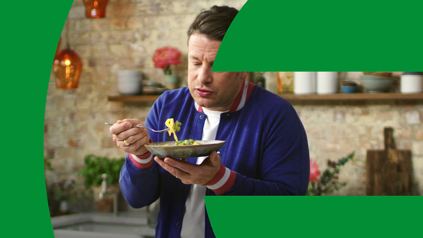
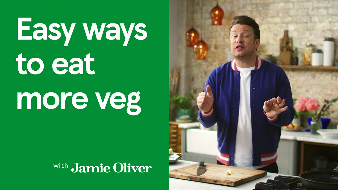
Jamie Oliver / 'Eat more veg' social packaging

Chiswick Auctions x Luxury Promise / social videos
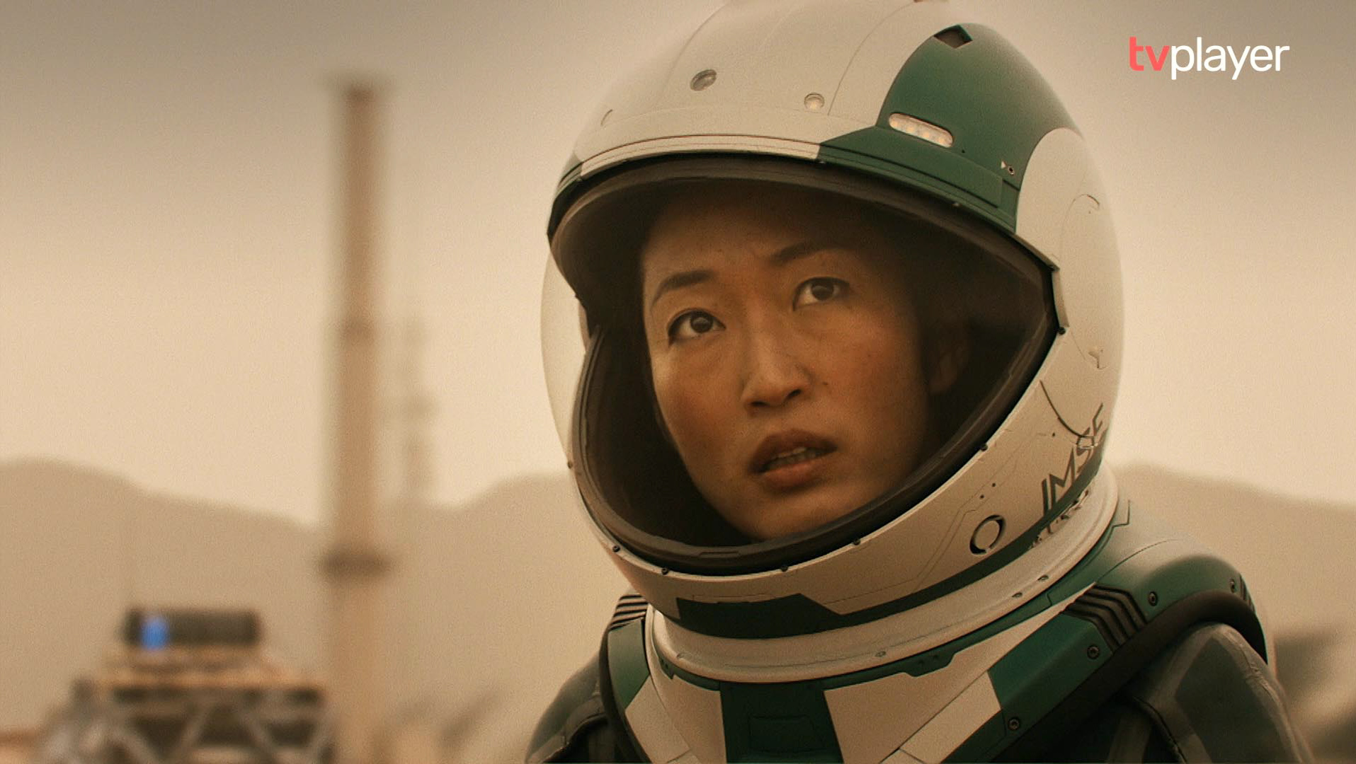
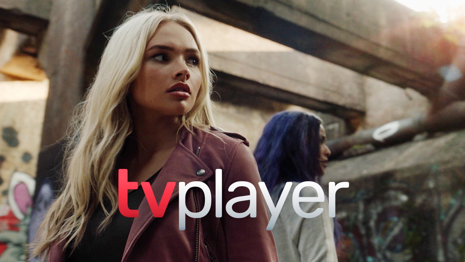
TVPlayer / TV ad
Channel 4 / 'Viewer Promise' video guide
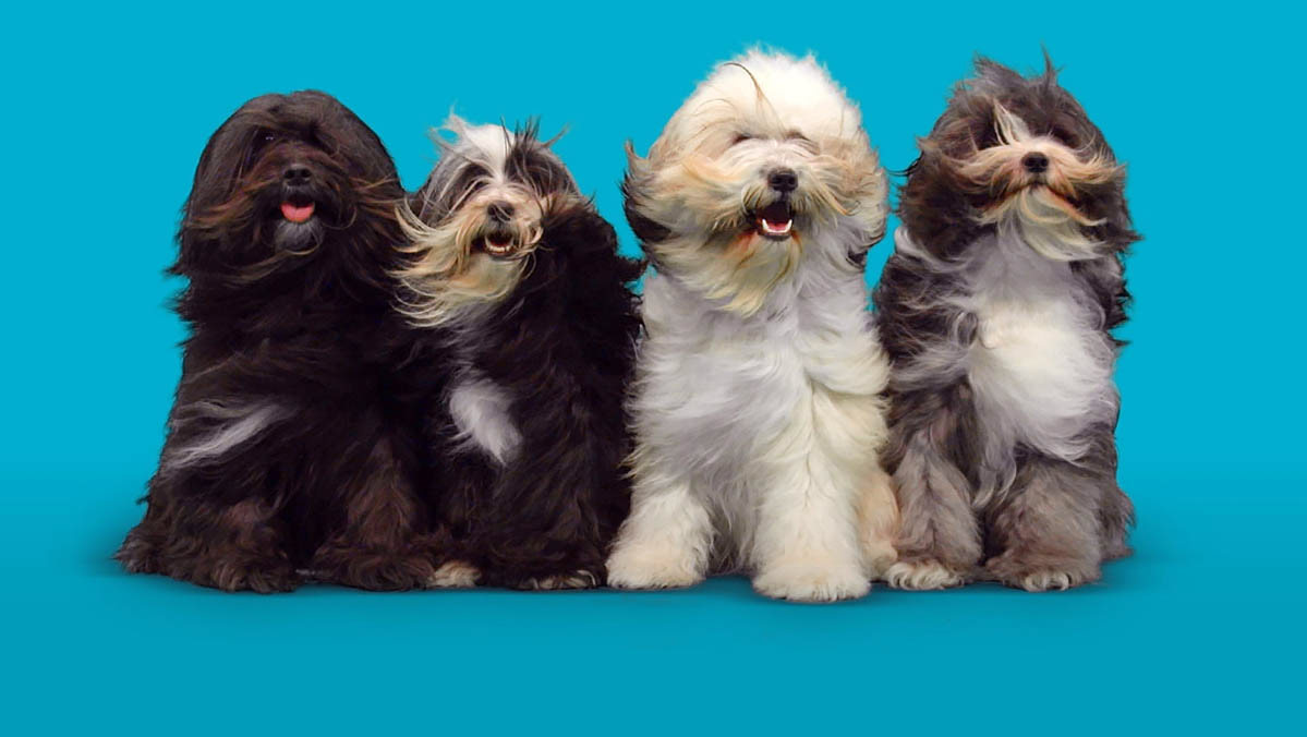
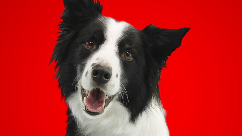
Crufts / outdoor digital campaign
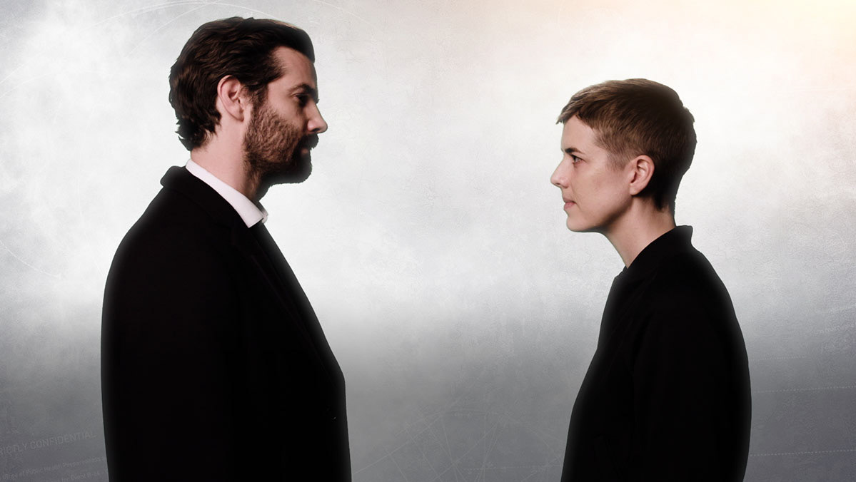
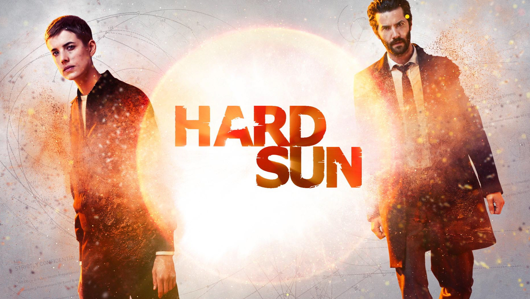
BBC / 'Hard Sun' motion poster

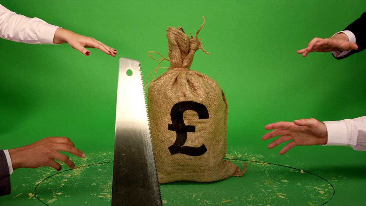
NatWest & RBS / 'ISAs' animated guides

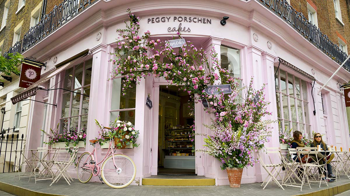
Dickinson & Doris / 'Peggy Porschen' video
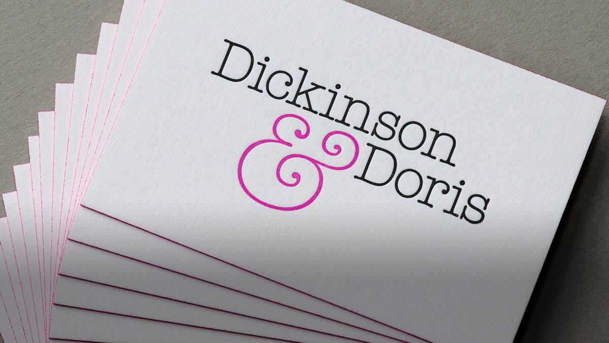

Dickinson & Doris / identity & website
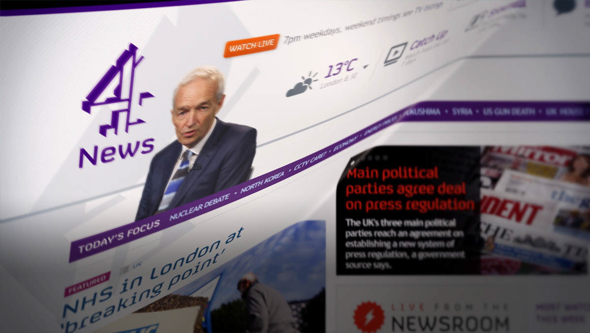
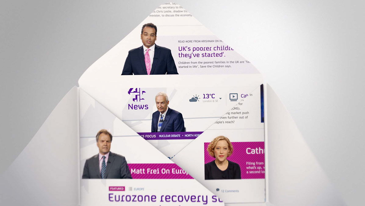
Channel 4 / 'Snowmail' promo
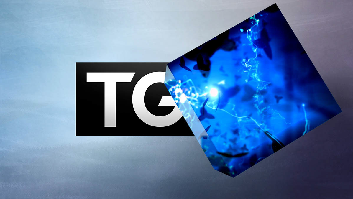
TG4 / identity